Bullish Candlestick Patterns in Technical Analysis: A Complete Guide


Understanding Bullish Candlestick Patterns
Bullish candlestick patterns are visual cues on price charts that signal either a potential reversal from a downward trend or the continuation of upward movement. These patterns usually form after a sustained price decline and suggest a possible start of a bull market, as buyers begin to overpower sellers.
Recognizing these patterns takes practice and experience. New traders can develop this skill by regularly reviewing charts on trading platforms and observing the formation of various candlestick configurations. Over time, the ability to spot bullish patterns quickly becomes second nature.
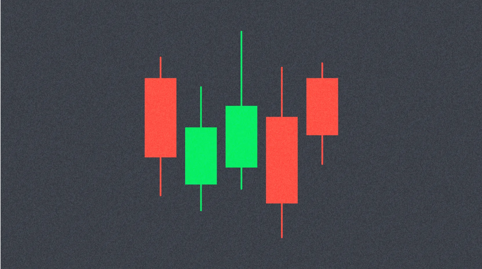
On charts, bullish candles are typically shown in green or white, making them visually distinct from bearish candles, which are red or black. Bearish candles indicate a likely drop in asset value. Each candle represents four key price levels: open, close, high, and low for the selected timeframe.
Bullish candlestick patterns should not be used as the sole basis for trading decisions. Professional traders rely on a holistic approach, combining candlestick analysis with other technical tools—such as identifying support and resistance, drawing trend lines, using technical indicators, and analyzing trading volume. Only by integrating these tools can traders get a more accurate view of market conditions and make sound decisions.
Bullish Reversal Candlestick Patterns
Bullish Engulfing
The bullish engulfing pattern is one of the most reliable signals for trend reversal. When it appears on a chart, it points to a significant increase in buying pressure, which can shift price direction from downward to upward.
This pattern consists of two consecutive candles. The first is a small bearish candle (red or black), reflecting ongoing downward movement. The second is a large bullish candle (green or white) that completely engulfs the body of the previous bearish candle. The bullish candle opens below the bearish candle’s close and closes above the bearish candle’s open.
For confirmation, experienced traders suggest waiting for the next candle to form. If it too is bullish, the reversal signal grows stronger. Some traders take a more conservative stance, only entering positions after the next candle closes above the engulfing candle’s high.
This pattern is most valid when it appears at the bottom of a clearly defined downtrend. If it forms during a sideways market or in the middle of a trend, its predictive power is much weaker.
Bullish Hammer
The hammer is a single-candle formation that appears at the lowest point of a downtrend, signaling a possible reversal. It features a small candle body and a long lower shadow (wick), at least twice as long as the body.
The hammer’s appearance has strong psychological impact. The long lower shadow shows that prices fell sharply under selling pressure during the session, but buyers regained control and pushed the price back up, closing near the session high. This demonstrates buyers’ strength and their commitment to defending current price levels.
Before acting on this pattern, traders should wait for confirmation from subsequent bullish candles. The ideal confirmation is the next bullish candle closing above the hammer’s high.
A variation called the inverted hammer has a long upper shadow and a short body at the base. This pattern also signals a shift in market control toward buyers, though it’s interpreted somewhat differently than the classic hammer.
Morning Star
The Morning Star is a powerful three-candle reversal pattern that often precedes significant price increases. It consists of three consecutive candles, each telling something about market dynamics.
The first candle is a large bearish candle (red or black, long body), confirming sellers’ dominance and continued downtrend. The second candle is much smaller and can be bullish or bearish, forming the “star”—a period of uncertainty where neither buyers nor sellers hold the advantage.
The third candle is a large bullish candle (green or white), closing well above the midpoint of the first bearish candle. This marks a decisive shift to buyers. The ideal pattern features price gaps on both sides of the middle candle, strengthening the signal for a likely trend reversal.
The bigger the third bullish candle and the higher it closes relative to the first candle, the stronger the reversal signal.
Harami
The Harami reversal pattern consists of two candles and forms at the bottom of a downtrend. Its name comes from the Japanese word for “pregnant,” reflecting its appearance—a smaller candle is completely contained within the range of a larger candle.
The first candle is a large bearish candle (long body), confirming the downtrend’s strength. The second is a small bullish candle, whose body lies entirely within the body of the first bearish candle. This signals reduced selling pressure and a potential reversal.
The Harami pattern indicates indecision in the market and potential exhaustion of bearish momentum. However, it’s a weaker reversal signal than the engulfing or Morning Star patterns, so additional confirmation from other technical indicators or subsequent candles is needed.
Trend Continuation Candlestick Patterns
Bullish Marubozu
The bullish Marubozu is one of the most recognizable candlestick patterns due to its distinctive shape—a candle with a long body (green or white) and either no shadows (wicks) or very short shadows on both ends.
No shadows mean the opening price equals the session’s low, and the closing price equals the session’s high. This shows buyers were in complete control throughout the session. Sellers offered no meaningful resistance, and price moved only upward.
When a bullish Marubozu forms during an uptrend, it’s a strong signal for trend continuation. The pattern shows buyers’ confidence and their willingness to aggressively purchase at current levels. The longer the candle’s body, the stronger the bullish signal.
Traders often use Marubozu’s appearance as confirmation of trend strength and an opportunity to add to existing long positions or open new ones.
Three Methods
The “Three Methods” pattern is a reliable model for uptrend continuation and consists of at least five candles. This formation represents temporary consolidation before the main upward movement resumes.
The pattern starts with a large bullish candle (white or green, long body) confirming the uptrend’s strength, followed by three or more small bearish candles (black or red, short bodies). These represent a period of correction or consolidation—some traders take profits during this time.
All corrective candles must stay within the range of the first large bullish candle. This shows the correction is controlled and doesn’t threaten the main uptrend.
To confirm the pattern, the fifth (or final) candle should be bullish and close above the highs of all previous candles, ideally above the first candle’s high. This signals renewed buying pressure and readiness for the market to continue upward.
Other Bullish Candlestick Patterns
Ascending Triangle
The ascending triangle is a consolidation pattern usually forming in an uptrend and signaling its likely continuation. It occurs when the asset’s price repeatedly tests a resistance level but can’t break through, while price lows are steadily rising.
On the chart, it looks like a triangle with a flat upper boundary (resistance) and a rising lower boundary formed by successive higher lows. This shows buyers are becoming more aggressive, willing to pay higher prices, and pushing the price toward resistance.
Each new higher low signals increasing buying pressure and confidence in further growth. When this pressure reaches a critical point, a breakout occurs above resistance, and price surges upward.
Not all breakouts succeed, however. A false breakout can lead to sharp price drops. Traders should use additional technical tools—such as volume analysis, momentum indicators, or oscillators—to confirm a breakout. Increased volume during a breakout greatly boosts the odds of sustained upward movement.
Bullish Flag
The bullish flag is a classic trend continuation pattern, often seen during strong price rallies. Its name comes from its resemblance to a flag on a flagpole.
The “flagpole” forms from a sharp, strong upward move, reflecting aggressive buying. After this rally, a brief downward consolidation forms the “flag.” This consolidation typically slopes gently downward and features reduced trading volume.
On charts, the bullish flag may appear as a small descending channel, a narrowing triangle, or a rectangle tilting slightly downward. Its key feature is declining volume during the flag’s formation, indicating a pause and profit-taking by early buyers.
This pause offers a favorable entry point for traders who missed the initial rally. Once the flag completes, a breakout above the upper boundary usually follows, with increased volume signaling the uptrend’s resumption.
Cup and Handle
The “Cup and Handle” is one of the most reliable patterns for continuing a long-term bull trend. It can form over weeks or months and often precedes a substantial price increase.
The pattern starts after a period of rapid price growth, followed by a gradual decline forming the left side of the “cup.” This decline is usually shallow and smooth, a healthy correction rather than a reversal. After bottoming, price starts to recover, forming the right side of the cup.
The ideal cup shape resembles a “U,” though a more “V” shape is possible. When price approaches the previous high, a “handle” forms—a brief correction or sideways consolidation. The handle is typically shorter and less pronounced than the cup.
Completion of the handle and breakout above the resistance formed by the cup’s rim signals entry for long positions. This breakout is often accompanied by increased trading volume and can drive significant price gains.
How to Use Bullish Candlestick Patterns in Trading
As emphasized throughout, relying only on bullish candlestick patterns for trading decisions is risky and insufficient. Professional traders always use a comprehensive analysis, combining candlestick patterns with other technical tools. Below are key indicators and methods that complement candlestick analysis.
Relative Strength Index (RSI)
The Relative Strength Index (RSI) is a leading technical oscillator. It measures the speed and magnitude of price changes, helping traders identify if an asset is overbought or oversold.
RSI is calculated based on the ratio of average gains and losses over a set period (usually 14 candles). Its values range from 0 to 100. When RSI falls to 30 or below, the market is oversold—signaling a potential end to a downtrend and possible reversal upward. Values of 70 or above indicate an overbought market, suggesting a correction or downward reversal may be imminent.
Using RSI alongside bullish candlestick patterns greatly improves the reliability of trading signals. For example, if a bullish reversal pattern forms in an oversold zone (RSI below 30), the odds of a successful trend reversal rise substantially. Traders also look for divergence between price and RSI to pinpoint potential reversal points.
MACD (Moving Average Convergence/Divergence)
MACD is a comprehensive trend and momentum indicator based on the interaction of several exponential moving averages. It includes three components: the MACD line, signal line, and histogram.
The MACD line is the difference between the fast (typically 12-period) and slow (26-period) exponential moving averages. The signal line is a 9-period moving average of the MACD line. The histogram visually shows the difference between MACD and the signal line, highlighting trend strength.
MACD generates trading signals in several ways. A crossover of the MACD and signal lines indicates a potential entry: a bullish signal occurs when MACD crosses the signal line from below. The zero-line crossover is also important—MACD above zero confirms an uptrend.
MACD is especially valuable for spotting divergences. If price makes new lows while MACD makes higher lows, that’s a bullish divergence, often preceding a trend reversal. Combining a bullish divergence in MACD with a bullish candlestick pattern creates a strong signal for opening long positions.
Risk Management with Stop-Loss Orders
Effective risk management is crucial for successful trading, and stop-loss orders are central to this. A stop-loss is a preset price level at which a position automatically closes, limiting losses.
When trading bullish candlestick patterns, the stop-loss is usually placed below the pattern’s low or a key support level. For the hammer pattern, place the stop-loss below the lowest point of the candle’s lower shadow. For the bullish engulfing pattern, set the stop-loss below the engulfing candle’s low.
Proper use of stop-loss orders offers several advantages. First, it strictly limits maximum loss per trade, allowing for better portfolio risk management. Second, stop-losses can be moved with price (trailing stop) to lock in profits.
Automatic stop-loss execution also frees traders from constant position monitoring and emotional decision-making, especially in volatile crypto markets, where prices can change rapidly.
Conclusion
Bullish candlestick patterns are powerful tools in technical analysis that, when used properly, can significantly enhance trading effectiveness. They help traders identify potential downtrend reversals and moments when uptrends continue, offering valuable insight into the balance between buyers and sellers.
However, it’s vital to remember that candlestick patterns are not sufficient on their own for trading decisions. They must be combined with other technical methods—such as momentum indicators (RSI, MACD), trading volume analysis, support and resistance identification, trend line and channel drawing.
A comprehensive market analysis helps filter out false signals and improves the odds of successful trades. Professional traders always seek confirmation of candlestick patterns through other indicators and the broader market structure.
Beyond technical analysis, traders must monitor fundamental factors and news. Major events—regulatory changes, tech updates, macroeconomic data, or statements by market leaders—can strongly impact asset prices. No technical tool can predict market reactions to unexpected news or important events.
Therefore, a successful trading strategy must combine technical analysis (including candlestick patterns), fundamental analysis, news monitoring, and robust risk management. Only this well-rounded approach empowers traders to make informed decisions and achieve consistent results in the fast-moving crypto markets.
FAQ
What are bullish candlestick patterns? What are the main types?
Bullish candlestick patterns signal the onset of market growth. The main types are reversal patterns (indicate a shift from decline to rise) and continuation patterns (show that the uptrend will persist).
How can you identify “hammer,” “engulfing,” and other common bullish candlestick patterns?
The hammer forms at the end of a downtrend, with a small body and a long lower wick, signaling a bounce. Engulfing is a strong bullish candle that completely covers the prior bearish candle. These patterns indicate a potential trend reversal.
How reliable are bullish candlestick patterns in technical analysis? What is the success rate?
Bullish candlestick patterns are highly reliable. The Cup and Handle pattern has a 95% success rate, inverse head and shoulders—89%, and double bottom—88%. Success rates range from 54% to 95%, depending on the pattern and market context.
How do you use bullish candlestick patterns to build a trading strategy and identify entry and exit points?
Bullish candlestick patterns signal price rise. The typical strategy: enter after the pattern forms, exit after a breakout above the pattern’s peak. Entry and exit points are defined by the pattern’s start and finish, based on support and resistance levels.
Can bullish candlestick patterns be combined with other technical indicators (like moving averages and RSI)?
Yes—combine bullish patterns with moving averages and RSI to confirm signals. When a candle breaks above the moving average and RSI is strong (above 50), the signal is reinforced, improving the odds of a price increase.
What are common risks and precautions when trading bullish candlestick patterns?
Main risks include sudden market reversals and price volatility. It’s essential to control trade size, check support levels, and monitor divergences. Strict risk and position management are necessary for successful trading.
Do bullish candlestick patterns differ across timeframes (daily, 4-hour, 1-hour)?
Yes—bullish candlestick patterns behave differently on various timeframes. Daily charts show long-term trends; 4-hour charts reveal medium-term moves; 1-hour charts highlight short-term fluctuations. The same pattern can signal differently depending on the timeframe.

How to Withdraw Money from Crypto Exchanges in 2025: A Beginner's Guide

Hedera Hashgraph (HBAR): Founders, Technology, and Price Outlook to 2030

Jasmy Coin: A Japanese Crypto Tale of Ambition, Hype, and Hope

IOTA (MIOTA) – From Tangle Origins to 2025 Price Outlook

Bitcoin Price in 2025: Analysis and Market Trends

How to Trade Bitcoin in 2025: A Beginner's Guide

What is a node in cryptocurrency and how do you set one up

Comprehensive Guide to Cryptocurrency Investment Selection

Smart Contracts: What They Are and How They Work

Comprehensive Guide to Value Investment Strategy: The Dr. Niwes Approach

How to Join Web3 Communities: DAOs and Leading Examples


