How do you interpret cryptocurrency trading charts?

Cryptocurrency trading is one of the most popular ways to generate returns with digital assets, but achieving success demands specialized knowledge and skills. The cryptocurrency market is inherently volatile, making it a much more dynamic and unpredictable environment than traditional foreign exchange (FX) or stock markets. While this high volatility provides substantial opportunities for profit, it also carries corresponding risks for traders.
Learning how to read Bitcoin charts is a critical skill that can make or break trading performance. With chart analysis, traders can pinpoint optimal entry and exit points, significantly improving their chances of success. This article offers a detailed explanation of essential technical indicators used for Bitcoin (BTC) and similar cryptocurrencies, along with practical chart patterns. By mastering these concepts, you can trade the cryptocurrency markets with increased confidence.
What Is Technical Analysis?
Technical analysis (TA) stands as one of the most widely adopted methodologies in cryptocurrency trading. This analytical approach forecasts future price movements by examining historical price and volume data. When assessing markets, two primary frameworks exist: technical analysis and fundamental analysis. While fundamental analysis evaluates external factors like news, events, economic indicators, and industry trends, technical analysis focuses on price charts and quantitative indicators.
The essence of technical analysis is using price charts to identify market trends, support and resistance levels, and momentum (the direction and strength of market movement). This enables traders to enter or exit positions with greater conviction. The core premise of technical analysis is that price movements reflect specific patterns driven by market psychology. This is based on the observation that traders tend to display similar behaviors when confronted with comparable market conditions.
It’s important to note that technical analysis does not measure the intrinsic value or fundamental strength of cryptocurrencies. Rather, it leverages mathematical indicators and historically validated chart patterns to estimate the probability of future price changes. This approach can be applied to decision-making across a wide range of timeframes, from short-term trades to long-term investment strategies.
Bull and Bear Markets (Buying and Selling Pressure)
Bitcoin and cryptocurrency markets generally move in three ways: upward, downward, or sideways. An upward-moving market is called a "bull market," marked by buying pressure outpacing selling pressure. Conversely, a downward-moving market is a "bear market," where selling pressure dominates. When prices remain within a certain range, this is known as a "range-bound market" or "consolidation phase."
The phrase "the trend is your friend" is well known in cryptocurrency trading. This adage highlights that following the prevailing price trend typically leads to higher success rates than trading against it. In practice, most cryptocurrency price action follows existing trends. Once established, major trends often persist over long periods, and market participants’ psychology tends to reinforce them.
Historically, both bull and bear cycles in Bitcoin can last for several years, and timing market reversals with precision is extremely challenging. Price trends rarely move in straight lines—minor reversals and corrections are common within larger trends. Successful cryptocurrency trading requires identifying the primary trend without getting distracted by short-term price fluctuations. By applying technical analysis and chart patterns effectively, traders can detect early signs of trend changes across various timeframes.
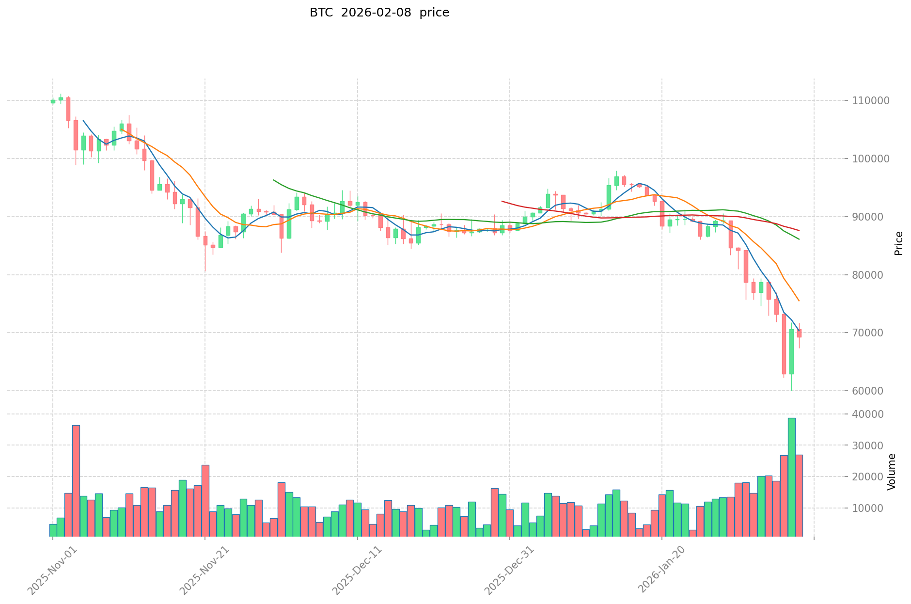
Moving Averages
Moving averages are foundational and highly significant technical indicators in cryptocurrency chart analysis. Their main role is to filter out short-term price "noise" and clarify the underlying trend. Moving averages plot a smoothing curve of average prices over a defined period, helping traders visualize the current market direction.
Two primary types of moving averages are used in crypto trading. The Simple Moving Average (SMA) calculates the arithmetic mean of prices across a set number of days. For instance, a 50-day SMA displays the average closing price over the past 50 days. The Exponential Moving Average (EMA) assigns greater weight to recent prices, making it more responsive to current market shifts.
Moving averages are especially valuable for identifying trend reversals. The 50-day and 200-day moving averages are the most widely used in crypto charting. These help traders assess long-term market structure and identify major support and resistance zones. Overlaying these two moving averages on a Bitcoin price chart provides insight into whether price is near a potential turning point or if a major trend change is underway.
The timing when these two moving averages cross is especially significant. Such crossovers serve as important signals for future price action or trend shifts. A Golden Cross forms when the 50-day average crosses above the 200-day average—signaling a transition from bearish to bullish and regarded as a strong buy signal. Conversely, a Death Cross happens when the 50-day average falls below the 200-day average, signaling a move from bullish to bearish and regarded as a sell signal.
Moving averages also act as dynamic support and resistance. When price crosses a moving average, the direction of the move indicates momentum: a break above suggests strengthening bullish momentum, while a move below signals increasing bearish momentum.
Support and Resistance Levels
Support and resistance are core concepts in cryptocurrency chart analysis. These represent price zones where reversals or pullbacks tend to occur, reflecting the psychology and supply-demand dynamics of market participants.
Resistance marks price levels where upward moves repeatedly encounter selling, keeping price advances in check. If price hits the same level multiple times but fails to break through, strong resistance is established—often because many traders are selling to take profits at this level.
Support marks price levels where downward moves repeatedly encounter buying, preventing further declines. If price drops to the same level several times but consistently rebounds, strong support is present—indicating many participants view this price as a buying opportunity.
A clear break of these levels is called a breakout. After a breakout, the psychological barrier is removed, and price often moves decisively in a new direction. Notably, a breached resistance often turns into support, and broken support can become new resistance—a phenomenon called "role reversal," which frequently presents trading opportunities.
Accurately identifying support and resistance underpins effective trading. By combining these levels with trend analysis, traders can more precisely determine when to enter and exit positions.
Fibonacci Analysis
Fibonacci retracement is a highly effective technical tool for cryptocurrency traders. It’s based on a sequence identified by the Italian mathematician Leonardo Fibonacci in the 13th century. The Fibonacci sequence expresses the golden ratio, a proportion found throughout nature and, surprisingly, in financial market price action as well.
Key Fibonacci retracement ratios are 0.236 (23.6%), 0.382 (38.2%), 0.500 (50%), 0.618 (61.8%), and 0.764 (76.4%). These ratios predict where price might temporarily reverse direction (pull back or retrace) after a strong move. The 61.8% level is especially significant—widely known as the "golden ratio"—and often marks major reversal zones.
The basic idea is that after a big move, price tends to retrace partway toward previous levels before resuming the trend. For example, if Bitcoin rises from $30,000 to $50,000, Fibonacci retracement can help identify likely pullback levels, such as $42,360 (38.2%) or $37,640 (61.8%).
Fibonacci levels frequently serve as support or resistance. Traders watch how price reacts at these levels: a rebound suggests the trend may continue, while a clean break points to deeper corrections or a trend reversal. Using Fibonacci analysis in combination with other technical indicators leads to more accurate trading decisions.
Other Technical Indicators
Beyond moving averages and Fibonacci analysis, cryptocurrency charting employs a variety of technical indicators. Each tool offers unique insights into market behavior for traders.
The Relative Strength Index (RSI) is a leading oscillator that measures market overheating. RSI values range from 0 to 100; readings above 70 indicate overbought conditions, and below 30 signal oversold. For instance, if Bitcoin’s price surges and RSI hits 80, a short-term correction is likely. If RSI drops to 20, it suggests excessive selling and an imminent rebound opportunity.
MACD (Moving Average Convergence Divergence) is an advanced indicator blending several moving averages. It shows the difference between short- and long-term EMAs, enabling traders to assess both trend direction and strength. A bullish signal occurs when the MACD line crosses above the signal line; a bearish signal when it crosses below. Changes in the MACD histogram visually reflect shifts in trend momentum.
Stochastics is a straightforward but effective momentum oscillator. It tracks the current close’s relative position within a set period’s price range. Stochastics also ranges from 0 to 100; readings above 80 are overbought, while below 20 are oversold. This indicator is especially valuable for timing entries and exits in sideways or range-bound markets.
The Parabolic SAR (Stop and Reverse) plots dots above or below the price on a chart. Dots below the candlestick indicate an uptrend, while dots above signal a downtrend. When the dots flip sides, it signals a potential trend reversal—an important cue for closing or reversing positions.
Bollinger Bands are a top tool for measuring volatility. These bands are plotted above and below a moving average using standard deviation. When price is stable, the bands contract; when price is volatile, they expand. If price touches the upper band, the market may be overbought; if it hits the lower band, it may be oversold. A band "squeeze" often foreshadows major price movement.
Other advanced indicators include the Ichimoku Cloud (IKH), Average Directional Index (ADX), Chaikin Oscillator, and more. For Bitcoin, traders also consider exchange trading volume, liquidity, and specialized on-chain metrics such as Hash Ribbons, Puell Multiple, Dynamic Range NVT Signal, Metcalfe’s Law, UTXO metrics, and the Bitcoin Energy Value Oscillator. These tools extend analysis beyond price charts, offering a more comprehensive view of the market using blockchain and network data.
Candlestick Charts
Developed in Japan, candlestick charts are the most widely used price visualization tool in crypto trading. Understanding their structure is a cornerstone of effective chart analysis. Each candlestick displays open, high, low, and close prices for a specific period (1 minute, 5 minutes, 1 hour, 1 day, etc.), giving an immediate view of price action.
Each candlestick consists of a "body" and "wicks" (shadows). The body—the thick section—shows the range between open and close. If the close is higher than the open, the candle is bullish (typically white or green). If the close is lower, it’s bearish (usually black or red). The wicks extending above and below the body mark the high and low of the period.
There are many important candlestick patterns, each providing insight into market psychology and likely price direction. For example, a Doji features nearly identical open and close, signaling indecision or a possible reversal. A Hammer has a long lower wick and small body—when it appears after a downtrend, it signals a bullish reversal. Conversely, a Shooting Star has a long upper wick and small body—at the top of an uptrend, it signals a bearish reversal.
Combinations of candlesticks also form critical patterns. A Bullish Engulfing pattern is a large bullish candle that completely covers the previous bearish candle, indicating strong buying pressure. A Bearish Engulfing is the opposite—a large bearish candle swallowing the previous bullish one, signaling significant selling pressure. Using these candlestick patterns alongside other technical indicators enables more precise trend forecasting.
Timeframes
Selecting the right timeframe is fundamental in crypto chart analysis. The same asset can look entirely different at different time intervals—a downtrend on a short-term chart might only be a pullback in a long-term uptrend. For this reason, multi-timeframe analysis is essential for trading success.
Most charting platforms provide a wide array of timeframes, from seconds to months. The optimal timeframe depends on trading style. Scalpers trade within seconds or minutes, using ultra-short timeframes (one minute or less) to capture quick, small moves.
Day traders execute multiple trades during a single day and close all positions before the market closes. They typically use 15-minute, 1-hour, or 4-hour charts to target intraday price swings. Swing traders and long-term investors hold positions for days, weeks, or months, focusing on daily, weekly, or monthly charts for their analysis.
An effective multi-timeframe strategy starts by identifying the broad trend with a weekly or monthly chart, confirming current conditions on the daily or 4-hour chart, and pinpointing entries on the 1-hour or 15-minute chart. This stepwise approach keeps traders oriented to the bigger picture while enabling precise entries and exits.
Cryptocurrency Chart Patterns
Certain recurring patterns in crypto charts allow traders to anticipate future price action with some probability. Chart patterns encapsulate collective market psychology and have proven reliable over time. They can signal reversals, trend continuations, or periods of indecision.
Reversal patterns mark the end of the current trend and the start of a new direction. The Head & Shoulders is among the most well-known reversal patterns, featuring three peaks with the center (head) higher than the shoulders. A break below the neckline signals a shift from uptrend to downtrend. The Inverse Head & Shoulders appears at the bottom of a downtrend, indicating a possible bullish reversal.
A Double Top forms when price tests the same high twice but fails to break through, signaling strong resistance and the end of an uptrend. A Double Bottom is the mirror image, with price testing the same low twice and rebounding, indicating strong support and an end to the downtrend.
The Cup & Handle is a long-term bullish pattern: after forming a rounded bottom (the cup), price consolidates (the handle) before resuming its uptrend—an important buy signal for long-term investors.
Continuation patterns suggest the prevailing trend will resume after a short consolidation. The Pennant is a small triangle formed by converging trendlines, with breakouts following brief pauses. The Flag is a rectangular consolidation after a sharp move, likely preceding a breakout in the original trend direction.
Neutral patterns can break out in either direction. The Symmetrical Triangle signals a large move is imminent; Ascending Triangles often break higher, while Descending Triangles tend to break lower.
Key concepts for trend continuation include higher highs and higher lows (uptrends) and lower highs and lower lows (downtrends). In an uptrend, price continually sets new highs and higher lows, reflecting persistent buying pressure and trend health. In a downtrend, price sets lower highs and lower lows, indicating sustained selling pressure.
Divergence is a crucial analytical concept—occurring when price and technical indicators move in opposite directions, offering early warnings of trend reversals. For example, if price makes a new high but RSI does not, this "bearish divergence" points to weakening momentum. If price sets a new low but RSI fails to do so, a "bullish divergence" may signal the end of a downtrend.
By mastering these chart patterns and applying them consistently, you can improve your odds of trading success. However, since patterns are never foolproof, disciplined risk management and a multi-indicator approach are essential.
FAQ
What are the basics of reading cryptocurrency charts? What do candlesticks, moving averages, and trading volume mean?
Candlesticks visualize price movement using open, close, high, and low data—bullish candles indicate price increases; bearish indicate declines. Moving averages reveal trend direction, and trading volume reflects the strength and engagement of market participants. Analyzing all three together enables a clearer assessment of market direction and intensity.
Which chart patterns indicate buy or sell signals?
Buy signals include the Double Bottom, Morning Star, and Hammer patterns. Sell signals include the Double Top, Head & Shoulders, and Three Black Crows. These candlestick patterns often coincide with changes in trading volume and serve as important markers for market reversals.
How do you use the major technical indicators (RSI, MACD, Bollinger Bands)?
RSI indicates overbought conditions above 70% and oversold conditions below 30%. MACD is used to determine trend direction. Bollinger Bands identify potential reversal points based on price volatility. Using multiple indicators together enhances analysis accuracy.
Do chart analysis techniques differ for short-term trading (day trading) versus long-term investing?
Yes, they differ substantially. Short-term traders focus on minute and hourly charts and trading volume, while long-term investors concentrate on daily and weekly trends and support/resistance levels. Chart analysis priorities depend on your investment style.
Is it risky to make trading decisions based solely on charts? What else should you consider?
Relying solely on charts is risky. It’s also important to monitor economic news, project updates, changes in trading volume, and market sentiment. Incorporating information from multiple sources leads to more informed decisions.
How should you combine multiple timeframes (1-minute, 1-hour, daily, etc.) in trading?
Monitor at least four timeframes at once. Use the daily chart for the overall trend, the hourly chart for the medium-term trend, and the 5-minute chart for short-term moves. When trends align across timeframes, trade signals are more reliable.
Share
Content
How to Buy Cryptocurrency


Trending Cryptocurrencies


How to Withdraw Money from Crypto Exchanges in 2025: A Beginner's Guide

Hedera Hashgraph (HBAR): Founders, Technology, and Price Outlook to 2030
Jasmy Coin: A Japanese Crypto Tale of Ambition, Hype, and Hope

IOTA (MIOTA) – From Tangle Origins to 2025 Price Outlook
Bitcoin Price in 2025: Analysis and Market Trends

How to Trade Bitcoin in 2025: A Beginner's Guide

Rafał Zaorski – Who Is He? What Is His Net Worth?

Games You Can Earn Money From – TOP 11 Games in 2025

Six Cryptocurrencies That Have Achieved Over 1,000x Total Growth

How to Choose and Set Up the Best Cryptocurrency Wallet in Recent Years

NANO/XNO Cryptocurrency Project: Future Prospects and Analysis
