A Beginner’s Guide to Reading and Analyzing Candlestick Charts

Candlestick Charts: A Beginner’s Guide
Introduction
Trading and investing in financial markets require more than just intuition; they demand a solid understanding of technical analysis tools. For newcomers, reading charts can be challenging, especially when making sound investment decisions. Relying on intuition alone might work during a short-term bull market, but it is not a sustainable strategy for long-term success.
At their core, trading and investing are about probability and risk management. That’s why being able to analyze and interpret charts is an essential skill for any market participant. Candlestick charts have become one of the most popular tools in technical analysis because they offer a clear visual of price movements and help traders make more informed decisions. Learning what a single candlestick represents is the first step toward trading success.
What Is a Candlestick Chart?
A candlestick chart is a specialized financial chart that visually depicts the price movement of an asset over a specific period. Its primary element is the candlestick—a graphical figure containing information about price action for a set time frame. What does a candlestick show? It’s a comprehensive indicator that presents four key price points at once: opening, closing, high, and low for the period. Every candlestick covers the same time interval, which can range from mere seconds to several years, depending on the analysis needs.
The origins of candlestick charts date back to 17th-century Japan. The technique is commonly credited to a Japanese rice trader named Homma, whose innovative approach to visualizing price data forms the foundation of modern candlestick charts. Later, these ideas were refined by experts such as Charles Dow, recognized as a founding figure in modern technical analysis.
Candlestick charts can be used to analyze many types of data, but they are most widely adopted in the financial industry. When applied properly, candlestick charts are a powerful tool, enabling traders to assess the likelihood of various price scenarios and build trading strategies based on objective market analysis.
How Do Candlestick Charts Work?
Building each candlestick requires four critical price points, which together create a complete picture of price activity for the period. What does a candlestick represent with respect to these points? It visualizes the ongoing contest between buyers and sellers during a specific interval.
Open — the initial trading price of the asset at the start of the time period. It marks where trading began during that interval.
High — the highest trading price reached during that period. This marks the peak of price activity within the selected timeframe.
Low — the lowest trading price recorded during the period. This marks the deepest price drop for that interval.
Close — the final trading price at the end of the period. This value captures the ending result of trading for the selected interval.
These four data points are commonly abbreviated as OHLC (Open, High, Low, Close). The relationship among them determines the shape and color of the candlestick, providing crucial insights into price behavior.
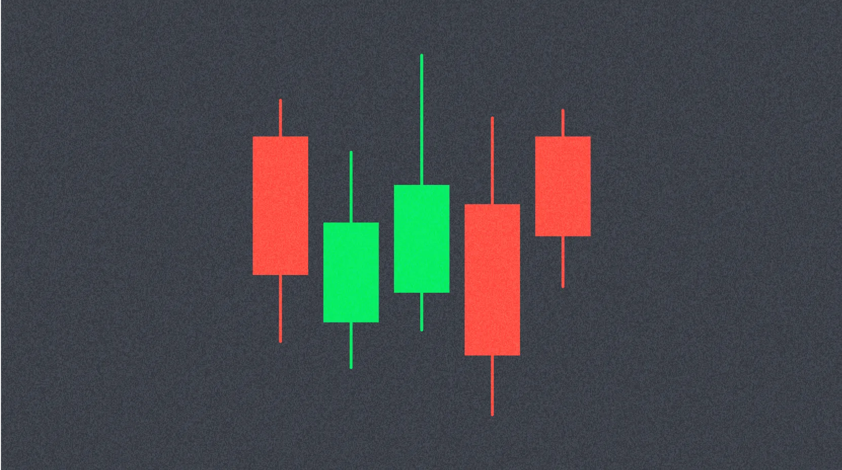
Structurally, each candlestick consists of two main parts: the body and the wick (or shadow). The body is the rectangle that represents the distance between the open and close prices. The wick is a thin line drawn above and below the body, showing the range from the body to the period’s high and low. The total range between the high and low is known as the candlestick’s range.
How to Read Candlestick Charts
Experienced traders often prefer candlestick charts over bar or line charts for their clarity and intuitive interpretation. While these chart types contain similar information, candlestick charts allow you to quickly assess market conditions and spot price trends at a glance.
What does a candlestick mean for practical trading? Each candlestick reflects the outcome of the battle between bulls (buyers) and bears (sellers) during a specific timeframe. The body’s size is a key indicator of which side had more strength: a longer body means greater buying or selling pressure in that period. Short wicks indicate that the period’s high or low was close to the closing price, suggesting a steady move in one direction.
Candlestick color schemes may vary depending on trading platform settings, but the most common system uses green and red. A green (or white) candlestick indicates the asset closed higher than it opened, meaning the price rose over the period. A red (or black) candlestick shows the opposite: the price dropped, and the close was below the open. Some traders use a black-and-white color scheme, with hollow candlesticks signaling price gains and filled ones showing losses.
Understanding what a particular candlestick’s shape and color mean helps traders quickly gauge market sentiment. Long green candlesticks with short wicks signal strong bullish momentum, while long red candlesticks with short wicks point to dominant selling pressure. Candlesticks with long wicks and small bodies suggest indecision and a tug-of-war between buyers and sellers.
What Candlestick Charts Can’t Show
Despite their clarity and value, candlestick charts have important limitations every trader should recognize. While candlesticks provide a broad view of price action, they do not offer a comprehensive analysis of all aspects of market activity.
A major limitation is that a candlestick does not reveal the detailed order of events between the open and close of the period. What does a candlestick mean in terms of chronology? It only reflects the distance between the open and close, along with the extreme high and low. For example, while the wicks show the highest and lowest prices reached, they do not indicate whether the high or low came first within the period.
Another issue is so-called “market noise”—random, chaotic price swings that are especially noticeable on short timeframes. On charts with small intervals, candlesticks can change rapidly, generating a flood of visual data that’s hard to interpret without experience. Most trading platforms let you adjust the timeframe, making it possible to view data at different levels of detail and get a clearer overall market picture.
Heikin-Ashi Candlesticks
Beyond traditional Japanese candlesticks, there are alternative ways to build candlestick charts, including the Heikin-Ashi technique. The term “Heikin-Ashi” translates from Japanese as “average bar,” which accurately describes its principle.
Heikin-Ashi candlesticks are built using a modified formula that relies on averaged price data rather than actual values. What does a Heikin-Ashi candle indicate compared to a standard candlestick? The main goal is to smooth price movements and filter out market noise, making trends more visible and charts easier to interpret. As a result, Heikin-Ashi charts make it much easier to spot trends, recognize patterns, and identify potential trend reversals.
Traders often use Heikin-Ashi candlesticks alongside traditional candlesticks. This combination helps filter out false signals and improves trend detection accuracy. Typically, green Heikin-Ashi candles with no lower wick indicate a strong uptrend, while red candles without an upper wick can signal a powerful downtrend.
However, like any technical analysis tool, Heikin-Ashi candles have drawbacks. Because they are based on averages, it may take longer for clear patterns to form compared to traditional candlesticks. They also do not show precise price differences and may obscure important details about real price action, which traders should consider when making decisions.
Practical Uses for Candlestick Charts
What does a candlestick mean in today’s trading environment? Traders across various trading platforms frequently use candlestick charts to analyze cryptocurrencies, stocks, commodities, and currency pairs. Whether you’re using centralized platforms or other trading tools, mastering candlestick analysis is crucial.
Modern traders combine candlestick analysis with other technical indicators such as trading volume, support and resistance levels, moving averages, and oscillators. This integrated approach offers a more complete perspective on market conditions and leads to more informed decision-making. What does a candlestick add when used with these tools? It becomes a vital part of a comprehensive analytical system that significantly raises the odds of successful trades.
Conclusion
Candlestick charts are among the most fundamental and indispensable tools in every trader’s or investor’s toolkit. What does a candlestick mean for trading success? It provides a clear visual of an asset’s price movement and offers flexibility for analyzing data across timeframes—from seconds to years.
Deep knowledge of candlestick charts and patterns, combined with analytical skills and ongoing practice, can give traders a distinct market edge. Understanding what various candlestick types and formations indicate, and how to interpret their shape, color, and placement, empowers traders to make more inf
FAQ
What does a candlestick symbolize?
A candlestick symbolizes light in darkness, illumination, and the life-giving power of the sun. In cryptocurrency analysis, a candlestick shows price movement for a specific period: the body reflects price action, and the wicks show the highs and lows.
What is a candlestick?
A candlestick is a graphical representation of an asset’s price over a set period. It shows the open, close, high, and low prices. A green candlestick signals a price increase, while a red one signals a decrease.
What does a candlestick represent?
In crypto analytics, a candlestick represents a trading period (usually an hour, day, or week). It shows the asset’s open, close, high, and low prices for that timeframe. The body displays the price range, and the wicks mark the highs and lows.
Share
Content
How to Buy Cryptocurrency


Trending Cryptocurrencies


How to Read Crypto Charts: Beginner's Guide to Trading

How to Interpret MACD, RSI, and Moving Averages for Crypto Trading Signals?
How to Interpret MACD, RSI, and Moving Averages for Crypto Trading Signals?
How to Interpret Technical Indicators for Crypto Trading Success?
How to Interpret Multiple Technical Indicators for Cryptocurrency Trading?

How to Use MACD, RSI, and KDJ Indicators for Technical Analysis of Cryptocurrencies?
Understanding NFT Mystery Boxes and Their Functionality

What is Chainlink (LINK) market overview: price, market cap $9.50B, and 24H trading volume $454.59M?

Creating Your First NFT: A Step-by-Step Guide

What is SUI crypto market overview: price, market cap, trading volume and liquidity in 2025?
What is DEP: A Comprehensive Guide to Data Execution Prevention and System Security