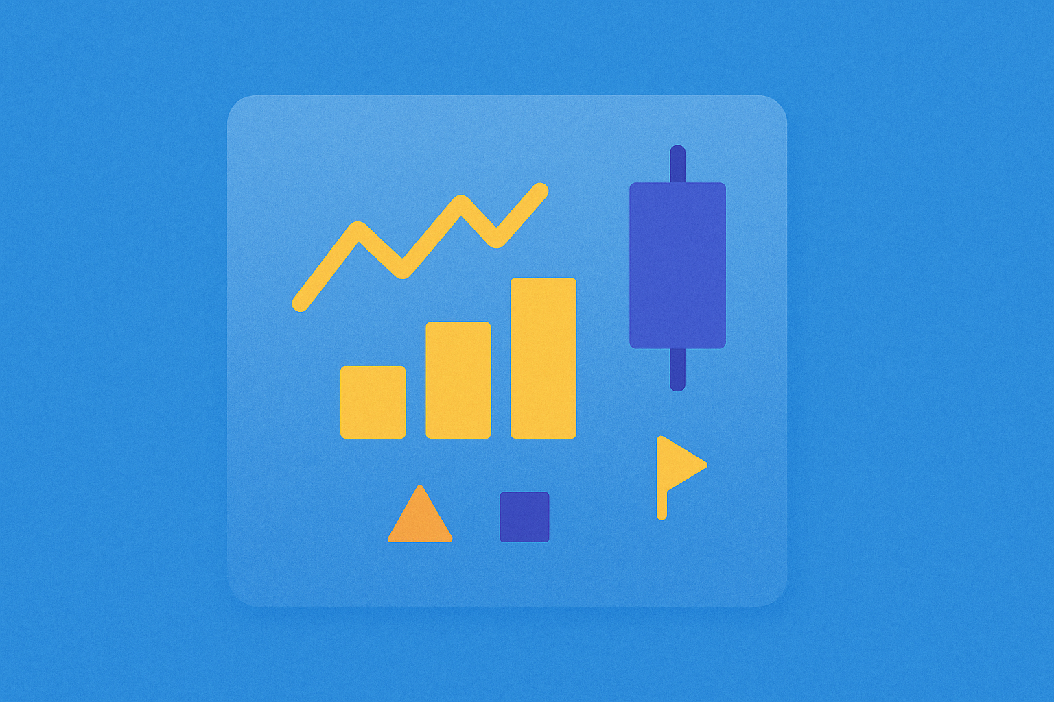
Chart Patterns and Basic Trading Strategies

Understanding Chart Patterns in Trading
Chart patterns represent the foundation of market understanding and trading plan development. The origin of chart patterns reflects perspectives and concepts in interpreting price movements. These patterns are essential tools that help traders identify potential market opportunities and make informed trading decisions.
Charts serve as the most fundamental tool for analyzing assets, whether stocks, currencies, gold, or cryptocurrencies, through recording price movements and displaying results across specified time periods. In recent years, numerous analysts and investors have attempted to discover various price patterns, believing that markets do not move randomly. Therefore, if patterns can be identified, traders may generate excess returns higher than simple buy-and-hold strategies. Chart patterns thus form the foundation of Technical Analysis.
What Are Charts?
At a basic level, charts can be displayed in three main formats, depending on investor preferences and requirements: Line Charts, Bar Charts, and Candlestick Charts.
Line Chart
Line charts are commonly seen not only in asset price charts but also in various data series displays, such as inflation rates, interest rates, population growth rates, and almost every type of data series. In the context of trading charts, line charts display only closing prices connected across each time period. This makes them suitable for long-term traders who are not concerned with short-term volatility or intraday fluctuations.
The simplicity of line charts allows traders to focus on overall trends without being distracted by price movements within individual periods. This format is particularly useful when analyzing long-term market direction and identifying major support and resistance levels.
Bar Chart
Bar charts specifically display price information. They show opening and closing prices, while the bar length represents the range between the highest and lowest prices during the period. If a bar is long, it indicates a large gap between the high and low points, reflecting higher volatility compared to shorter bars.
Bar charts provide more detailed information than line charts, allowing traders to see the complete price range for each period. This additional information helps in identifying price rejection zones and understanding market sentiment during specific time frames.
Candlestick Chart
Candlestick charts are currently the most popular format due to their high level of data detail. They typically display opening, closing, highest, and lowest prices, similar to bar charts, but feature colored bodies (red and green) for easier reading. Green candles indicate closing prices higher than opening prices, while red candles show closing prices lower than opening prices. The wick lines above and below the body represent volatility, similar to bar charts.
With clear data visualization and rapid interpretation capabilities, candlestick charts are popular among all types of traders, including scalpers, day traders, and long-term holders. The visual clarity of candlestick patterns makes it easier to spot reversal signals and continuation patterns quickly.
What Are Chart Patterns?
Chart patterns are tools used to develop trading strategies, such as identifying reversal points or breakouts to find entry and exit points. Pattern formations emerge from analysts discovering recurring price movement patterns over time. These patterns represent the collective psychology of market participants and their reactions to price levels.
However, traders should understand that no chart pattern can predict asset prices with 100% accuracy. Popular patterns are those that people have discovered and compiled statistical data suggesting a probability greater than 50%, or patterns believed not to occur by coincidence at that time. Therefore, traders should invest cautiously and manage risk by setting stop-loss orders.
The effectiveness of chart patterns lies in their ability to provide a framework for understanding market behavior. By recognizing these patterns, traders can better anticipate potential price movements and position themselves accordingly. However, it's crucial to combine pattern recognition with other forms of analysis and risk management techniques.
Interpreting Chart Structure Patterns
Initially, every chart pattern consists of trendlines, support and resistance levels, and the formation of new highs or new lows. These three components act as a framework governing price movements, creating the appearance of patterns. When prices have sufficient momentum to break out of this framework, the breakout point often generates a new trend and typically serves as a confirmation point for traders to open positions.
Understanding the interplay between these structural elements is essential for successful pattern trading. Trendlines help identify the overall direction, support and resistance levels define key price zones, and new highs or lows signal potential trend changes or continuations.
Types of Chart Patterns
Chart patterns can be divided into three main categories:
Continuation Patterns
These patterns indicate that prices are likely to continue developing in the original direction. They typically occur after prices consolidate during a trend or accumulate in the short term. Continuation patterns suggest that the prevailing trend remains intact and will likely resume after a brief pause. Traders often use these patterns to add to existing positions or enter new positions in the direction of the main trend.
Reversal Patterns
These patterns signal that the current trend may be ending and reversing in the opposite direction. Reversal patterns are crucial for traders looking to exit positions or enter counter-trend trades. These patterns often form after extended trends and represent a shift in market sentiment from bullish to bearish or vice versa.
Sideways Patterns
Sideway patterns show that prices have not yet chosen a direction. Investors should prepare and be cautious of increased volatility when prices break out of the range, forming a new trend. These patterns represent periods of consolidation or indecision in the market, often preceding significant price movements.
Eight Chart Patterns: Basic Trading with Fibonacci Targets
Three Continuation Patterns
Cup and Handle Pattern
The Cup and Handle pattern is one of the consolidation patterns that commonly appears in medium to long-term charts before prices continue upward. This pattern consists of a left cup rim where prices gradually decline to support and slowly rise, forming a rounded cup bottom. Prices are then rejected again at the right rim, but prices do not make a lower low and break out from the cup rim, causing the trend to continue upward.
The cup formation typically takes several weeks to months to develop, reflecting a gradual shift in market sentiment. The handle represents a final consolidation phase where weak hands exit before the breakout occurs. Traders can set targets equal to the size measured from the cup's lowest point to the cup rim, from the lowest point of the handle consolidation. Volume analysis is particularly important in this pattern, as the breakout should occur on increasing volume to confirm the pattern's validity.
Flag Pattern
The Flag pattern is a short-term consolidation pattern during an ongoing trend, such as during an uptrend with a pullback. During the consolidation period, prices move slowly downward, making lower highs and lower lows continuously within parallel support and resistance channels. This pattern resembles a flag on a pole, where the pole represents the strong trend preceding the consolidation.
When prices break out above resistance, they typically continue upward. Trading literature commonly suggests that prices will adjust upward by approximately 68-100% of the old trend before consolidation, which can be set as a take-profit point. Traders can measure this using Fibonacci Extension from the lowest point during consolidation. The flag pattern is considered one of the most reliable continuation patterns, especially when it forms quickly and on declining volume.
Pennant Pattern
The Pennant pattern is a short-term consolidation pattern similar to the Flag, but during the consolidation period, support and resistance levels converge into a triangle with low volatility and low volume. However, when a breakout occurs, prices surge violently, with targets at 68-100% of the old trend measured from the point where prices break out of the range.
The pennant typically forms over a shorter period than the flag, usually lasting from one to three weeks. The converging trendlines indicate decreasing volatility and an impending breakout. Traders should wait for a clear breakout with increased volume before entering positions, as false breakouts can occur in this pattern.
Three Reversal Patterns
Head and Shoulders Pattern
This pattern is one of the most discussed and frequently occurring patterns in markets. It typically forms before a trend reverses from up to down or down to up. In the case of an uptrend reversing to downtrend, prices swing three times, forming a left shoulder, head, and right shoulder, where the right shoulder cannot break through the resistance at the same price level as the left shoulder. After that, if prices break out from support, the pattern is considered confirmed.
The formation closely resembles the Elliott Wave concept when prices complete Wave 5 at the head section and prices adjust downward. The target can be roughly measured from the size of the trend from the highest point at the head to support, setting the target with the same size measured down from the neckline. This pattern is particularly reliable when the volume pattern shows increasing volume during the formation of the left shoulder and head, followed by decreasing volume at the right shoulder.
Double Top/Bottom Pattern
The Double Top pattern frequently occurs in trading, showing weakness at the end of a trend where prices cannot make new highs despite attempts. This creates price rejection at the same resistance level or horizontal resistance, forming an M shape (W shape for downtrends). Understanding the psychology behind this pattern is crucial: the first top represents an initial attempt to continue the trend, while the second top shows that buyers lack the strength to push prices higher.
Whenever prices break through support before testing resistance the second time, the pattern is considered confirmed. The minimum price target should be at least 100% of the minor trend between the support and the highest point testing resistance the second time. Traders often look for volume confirmation, with the second top typically forming on lower volume than the first, indicating weakening buying pressure.
Triple Top/Bottom Pattern
This pattern resembles the Double Top/Bottom but involves three tests before reversal. If prices break out, the resulting new trend will be more violent than Double Top/Bottom because the pattern clearly shows that prices cannot continue in the original direction despite three attempts. Price targets can be set at 123-168% of the minor trend size within the parallel channel.
The triple formation provides even stronger confirmation of trend exhaustion than the double pattern. Each successive test that fails to break through the key level further confirms the strength of that level and the likelihood of a reversal. This pattern requires patience from traders, as it takes longer to form, but offers more reliable signals when confirmed.
Two Sideways Patterns
Wedge Pattern
Wedge patterns (Falling Wedge/Rising Wedge) can occur when prices begin to show hesitation, with support and resistance levels converging to form a triangle-like wedge. When prices break out of the range, significant price changes typically occur violently. However, this pattern can also reverse and continue in the original direction, making it difficult to trade and strategize. Traders should wait for trend confirmation before finding opportunities to open positions.
Falling wedges typically indicate bullish reversals, while rising wedges suggest bearish reversals. The key characteristic is that volume should decrease as the wedge forms and increase dramatically on the breakout. The wedge pattern requires careful analysis of both price action and volume to distinguish between genuine breakouts and false signals.
Rectangle Pattern
The Rectangle pattern is a sideways pattern where prices can break out in either direction. Prices show low volatility, low volume, and move between support and resistance in parallel lines. Traders often call this price moving sideways. Price targets can be measured according to the channel size, rising from the breakout point by the same size.
Rectangle patterns represent periods of equilibrium between buyers and sellers, with neither side able to gain control. These patterns can last from several weeks to several months and often form during major trend pauses. The longer the rectangle formation, the more significant the eventual breakout tends to be. Traders should monitor volume carefully, as a valid breakout should occur on significantly increased volume compared to the consolidation period.
Conclusion
Chart patterns are statistical tools discovered by analysts showing that prices have certain patterns that tend to recur, allowing investors to use them to analyze market conditions and develop trading strategies. These patterns have evolved over decades of market observation and continue to be relevant in modern trading across all asset classes.
The patterns that emerge fall into three categories: continuation patterns, reversal patterns, and sideways patterns. Experienced investors may incorporate concepts such as support and resistance levels, Fibonacci ratios, and other indicators to assist in decision-making and planning. The integration of multiple analytical tools increases the probability of successful trades and helps filter out false signals.
These patterns can be applied to all types of trading, whether scalping, day trading, or swing trading. However, investors should understand that these patterns do not guarantee that prices will develop as expected with 100% certainty. Therefore, investors must always consider risk management, such as setting stop-loss orders. Successful pattern trading requires discipline, patience, and a thorough understanding of market dynamics beyond just recognizing the patterns themselves.
FAQ
What are chart patterns? What are the most common chart patterns?
Chart patterns are graphical formations used to analyze and predict market trends. The most common patterns include head and shoulders, double tops and bottoms, triangles, and wedges. These patterns help traders identify potential price reversals and trend continuations in cryptocurrency markets.
How to identify and confirm classic chart patterns such as head and shoulders top/bottom, double top/bottom?
Head and shoulders and double top/bottom are reversal patterns. Head and shoulders top forms at the end of uptrends signaling trend reversal. Double top/bottom appears at trend peaks/troughs with price testing support/resistance twice. Confirm by identifying three peaks (head and shoulders) or two equal highs/lows, with volume decrease at pattern formation, then breakout below/above neckline.
Triangle, wedge, and flag chart patterns respectively indicate what market trends?
Triangle patterns suggest consolidation before breakout; wedges indicate potential trend reversal; flags show brief consolidation within a trend, predicting continuation in the same direction.
How to formulate basic trading strategies based on chart patterns? How to set entry and stop-loss points?
Set entry points at pattern breakouts. Place stop-loss below the right shoulder to control risk. Target price equals the distance from peak to neckline plus breakout level. This manages risk effectively in chart pattern trading.
What is the role of support and resistance levels in chart patterns? How to apply them correctly?
Support and resistance levels are key price zones where trends pause or reverse. Support prevents price drops while resistance limits rallies. Apply them by identifying historical price bounces at these levels, using them to set entry points and stop losses, and recognizing breakouts that signal new trends. Proper application enhances trading accuracy.
How to avoid common errors and false signals in chart pattern recognition?
Use multiple indicators for confirmation, consider broader market context and timeframe alignment. Avoid emotional trading and rely on proven risk management. Combine technical analysis with volume analysis and market sentiment to filter out false signals effectively.
What are the risk management and capital management principles for chart pattern trading strategies?
Set stop-loss and take-profit levels for each trade. Allocate only 1-2% of total capital per trade. Use proper position sizing based on risk tolerance. Combine patterns with technical indicators for confirmation. Monitor trades actively and adjust stops as price moves favorably.
Share
Content
Understanding Chart Patterns in Trading
What Are Charts?
What Are Chart Patterns?
Interpreting Chart Structure Patterns
Types of Chart Patterns
Eight Chart Patterns: Basic Trading with Fibonacci Targets
Cup and Handle Pattern
Flag Pattern
Pennant Pattern
Head and Shoulders Pattern
Double Top/Bottom Pattern
Triple Top/Bottom Pattern
Wedge Pattern
Rectangle Pattern
Conclusion
FAQ
How to Buy Cryptocurrency


Trending Cryptocurrencies


How to Withdraw Money from Crypto Exchanges in 2025: A Beginner's Guide

Hedera Hashgraph (HBAR): Founders, Technology, and Price Outlook to 2030

Jasmy Coin: A Japanese Crypto Tale of Ambition, Hype, and Hope

IOTA (MIOTA) – From Tangle Origins to 2025 Price Outlook

Bitcoin Price in 2025: Analysis and Market Trends

How to Trade Bitcoin in 2025: A Beginner's Guide

GORK vs QNT: A Comprehensive Comparison of Two Emerging Blockchain Technologies and Their Market Impact

WLTH vs ICP: A Comprehensive Comparison of Two Leading Internet Computer Ecosystem Tokens

ADAPAD vs BTC: Which Cryptocurrency Offers Better Investment Potential in 2024?

MP vs MANA: Understanding the Key Differences Between Magic Points and Mana in Gaming
ETHS vs XTZ: A Comprehensive Comparison of Two Leading Blockchain Platforms and Their Investment Potential