A comprehensive introduction to reading cryptocurrency charts for beginners. Explore essential concepts such as technical analysis, moving averages, support and resistance lines, candlestick charts, RSI, MACD, and more. Develop the chart analysis skills you need to trade effectively on Gate.
What Is Technical Analysis?
Technical analysis (TA) is a method for forecasting potential price changes by analyzing historical and current market data. This approach involves closely examining cryptocurrency price charts to identify market trends, pinpoint support and resistance levels, and measure price momentum.
The foundation of technical analysis is the idea that cryptocurrency price movements follow certain patterns, reflecting the psychology of market participants. Patterns that have repeatedly appeared in the past are likely to reemerge under similar market conditions.
Technical analysis does not assess the fundamental (intrinsic) value of cryptocurrencies. Instead, it employs historical data, mathematical indicators, and established chart patterns to estimate the probability of future price movements. As such, technical analysis is particularly effective for short- and medium-term trading strategies.
Bullish (Buy Pressure) and Bearish (Sell Pressure)
Cryptocurrency markets—including Bitcoin—generally move in three directions: upward trends, downward trends, and sideways trends.
An upward-trending market is known as a "bull market," where buying pressure outweighs selling pressure. In contrast, a downward-trending market is called a "bear market," dominated by selling pressure. Sideways trends are referred to as "range-bound markets" or "consolidation phases," where buying and selling forces are balanced.
One core principle of crypto trading is that "following the trend typically offers a higher probability of success than trading against it." In practice, traders are advised to consider long positions during sustained uptrends and short positions during persistent downtrends to manage risk. Predicting trend reversals with precision is extremely difficult, so most traders adopt trend-following strategies.
Moving Averages
Moving averages are among the most widely used technical indicators in cryptocurrency chart analysis. Their main purpose is to filter out short-term price fluctuations—market "noise"—and reveal the underlying trend direction.
Two primary types of moving averages are commonly used in crypto charting:
Simple Moving Average (SMA)
Calculates the average closing price over a specified period. For example, a 50-day SMA adds closing prices from the past 50 days and divides by 50. All prices are weighted equally, making this indicator easy to calculate and interpret.
Exponential Moving Average (EMA)
Gives more weight to recent price data, making it more responsive to new price changes. This attribute helps traders spot trend shifts earlier and is especially popular among short-term traders.
The 50-day moving average and 200-day moving average are the most commonly used in crypto chart analysis. Crossovers between these two averages are widely seen as key signals of market trend reversals.
Golden Cross
Occurs when the 50-day moving average crosses above the 200-day moving average from below. This is regarded as a major bullish reversal signal, often used to identify buy entry opportunities.
Death Cross
Happens when the 50-day moving average crosses below the 200-day moving average from above. This is considered a bearish reversal signal, prompting traders to reduce positions or initiate sell orders.
Support and Resistance Levels
Support and resistance levels are essential concepts for analyzing cryptocurrency price charts.
Support Level
A price zone where increased buy pressure makes further declines less likely. Areas where prices have repeatedly bounced in the past tend to act as strong support. Traders often look to enter long positions near support, and concentrated buy orders at these levels make actual rebounds more probable.
Resistance Level
A price zone where increased sell pressure limits further price advances. Levels that have repeatedly rejected price increases serve as strong resistance. Many traders place profit-taking sell orders at these levels, making it harder for prices to push higher.
Breakout
A breakout occurs when price decisively moves beyond a support or resistance level. If resistance breaks upward, it often becomes new support; if support breaks downward, it may turn into new resistance. Breakouts are important signals for accelerating trends or marking the start of new ones.
Fibonacci Analysis
Fibonacci retracement is a vital tool for crypto traders. This method is based on the sequence discovered by 13th-century Italian mathematician Leonardo Fibonacci and employs specific ratios found in nature and financial markets.
The main ratios used in Fibonacci retracement are **23.6%, 38.2%, 50.0%, 61.8%, and 76.4%**. These are used to estimate how far a price may retrace following a large move.
How It Works
After a significant price rally, traders apply Fibonacci ratios to the range from the start of the move to its peak. Horizontal lines are drawn at the 38.2%, 50.0%, and 61.8% levels, which may act as potential support or resistance zones.
Because many traders use Fibonacci retracement, orders often cluster at these levels, and prices frequently react accordingly. The 61.8% retracement is especially known as the "golden ratio" and is regarded as the most critical level.
Other Technical Indicators
Besides moving averages and support/resistance levels, crypto chart analysis incorporates many other technical indicators. The following are especially important:
RSI (Relative Strength Index)
RSI measures whether an asset is overbought or oversold, ranging from 0 to 100. Readings below 30 generally indicate oversold conditions; above 70, overbought. Prices often rebound when oversold and correct when overbought.
MACD (Moving Average Convergence Divergence)
MACD combines EMAs of different durations to pinpoint trend direction, strength, and reversal points. Crossovers between the MACD and signal line are widely used trading signals.
Stochastic Oscillator
This indicator shows where the closing price sits within the range of highs and lows over a set period. It's used to gauge overbought/oversold conditions and anticipate trend continuation or reversals.
Parabolic SAR (Stop and Reverse)
Displayed as dots on a price chart, Parabolic SAR indicates trend direction and potential reversal points. Dots above price suggest a downtrend; dots below signal an uptrend.
Bollinger Bands
Bollinger Bands plot bands above and below a moving average, based on standard deviation. They visualize price volatility: wider bands mean higher volatility, narrower bands lower volatility. When price breaches the bands, a rebound or correction becomes more likely.
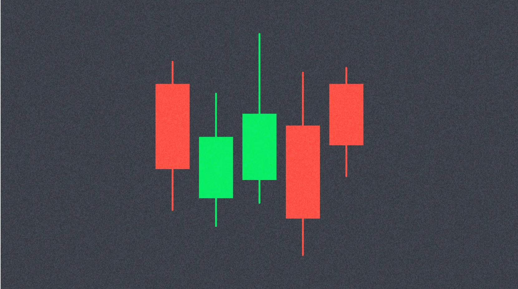
Candlestick Charts
Originating in Japan, candlestick charts are the most popular method for displaying price in crypto trading. Mastering the candlestick chart is fundamental to technical analysis.
Candlestick Structure
Each candlestick captures price movements over a specific time interval and includes four key values:
- Open: Start price for the period
- High: Highest price reached
- Low: Lowest price reached
- Close: End price for the period
The thick "body" shows the range between open and close, while the thin "wick" or "shadow" marks the high and low. A green (or white) candle means close exceeds open (bullish); red (or black) means close is below open (bearish).
Time Frames
Time frame selection is critical in crypto chart analysis and varies by trading style.
Short-Term Traders (Scalpers)
Scalpers execute multiple trades within seconds or minutes, using ultra-short time frames like 1-minute or 5-minute charts. Their strategy focuses on capturing minor price moves for incremental gains.
Day Traders
Day traders open and close positions within a single day, using charts such as 15-minute, 1-hour, or 4-hour intervals. This approach captures intraday movement while avoiding overnight risk.
Swing Traders & Long-Term Investors
Traders and investors who hold positions for days, weeks, or longer rely on daily, weekly, or monthly charts. Their aim is to capture major trends while filtering out short-term volatility.
Cryptocurrency Chart Patterns
Cryptocurrency price charts display recurring patterns that help forecast future price behavior. Chart patterns generally fall into three categories:
1. Reversal Patterns
Patterns signaling the end of an existing trend and the start of a new trend in the opposite direction.
- Head & Shoulders: Classic pattern marking the end of an uptrend and beginning of a downtrend
- Inverse Head & Shoulders: Signals the end of a downtrend and start of an uptrend
- Cup & Handle: Bullish continuation or reversal pattern with a rounded base followed by a brief consolidation and breakout
- Double Top/Double Bottom: Price reverses twice at the same level, indicating a strong reversal signal
- Rising & Falling Wedge: Formed by converging trend lines, often signaling a trend reversal
2. Continuation Patterns
Patterns indicating temporary consolidation before the trend resumes in the original direction.
- Pennant: Brief consolidation followed by resumption of the prior trend
- Rectangle: Price moves between horizontal support and resistance, with trend continuation after breakout
- Flag: Sharp move followed by consolidation in a parallel channel and then trend continuation
3. Neutral Patterns
Patterns where future trend direction is uncertain.
- Symmetrical Triangle: Formed by converging upper and lower trend lines; breakout direction determines the trend
- Ascending/Descending Triangle: One trend line is horizontal, the other slopes; breakout direction is easier to anticipate
How to Identify Trend Continuation or Reversal
Higher High, Higher Low
When price sets a new high and a higher low compared to the previous low, this signals a healthy uptrend continuation.
Lower High, Lower Low
When price fails to set a new high and forms a lower low, it signals the continuation of a downtrend.
Divergence
Divergence arises when price and a technical indicator (such as RSI or MACD) move in opposite directions. For instance, if price reaches a new high while RSI drops, it suggests weakening bullish momentum and a greater chance of reversal. Divergence is a critical early warning sign for trend changes.
Top Resources for Learning Cryptocurrency Chart Analysis
To sharpen your chart analysis skills, it's essential to keep learning from trusted sources. The following resources offer valuable guidance for mastering technical analysis:
TradingView
A leading charting platform used worldwide. Its free version covers all essential technical indicators and is suitable for both beginners and experts. Robust social features enable users to share analysis and insights.
BabyPips
A renowned education site for forex trading, offering systematic guides to technical analysis and chart reading basics. Beginner-friendly explanations make it easy to get started.
Twitter (X)
Following top crypto analysts and experienced traders provides real-time market analysis and insights. It's important to vet the reliability of information you encounter.
BeInCrypto
A crypto-focused media outlet delivering daily expert technical analysis. Their coverage helps readers gain practical knowledge through market trend analysis and detailed chart breakdowns.
Applying insights from these sources and practicing with real charts will help you progressively build your cryptocurrency chart analysis skills.
FAQ
What Is a K-Line (Candlestick) on a Crypto Chart? How Should You Read It?
A K-line (candlestick) is a charting tool that displays open, close, high, and low prices in a single bar. If the close is above the open, the candle is bullish (rising); if below, bearish (falling). The thick "body" shows the open–close range, while the thin "wick" marks the high and low. Different time frames support both short- and long-term trend analysis.
How Are Technical Indicators Like Moving Averages (MA) and RSI Used in Crypto Trading?
Moving averages (MA) reveal price trend direction, while RSI gauges overbought and oversold conditions. Using these together helps you identify entry and exit points for trades.
How Can You Identify Support and Resistance on a Crypto Chart?
Use historical lows as reference points for support and highs for resistance. Prices often rebound at these levels. The more times price "touches" a line, the stronger its reliability.
How Should You Use Charts with Different Timeframes—Like 1-Hour, Daily, or Weekly?
Use 1-hour charts for short-term trades, 4-hour/daily charts for swing trades, and weekly/monthly charts for long-term investment. Multi-timeframe analysis—combining several chart intervals—lets you spot major trends and optimize trade timing to maximize your results.
What Common Mistakes or Pitfalls Should Beginners Avoid in Crypto Chart Analysis?
Typical mistakes include poor risk management, lack of a trading plan, ignoring diversification, overlooking market trends, and dismissing technical analysis. Avoid emotional decisions—focus on data-driven analysis for the best outcomes.
* The information is not intended to be and does not constitute financial advice or any other recommendation of any sort offered or endorsed by Gate.