This guide introduces technical chart analysis for cryptocurrencies in a way that's accessible to beginners. It covers key indicators—moving averages, RSI, MACD, and Bollinger Bands—explains how to read chart patterns, and demonstrates practical investment strategies for Bitcoin and other cryptocurrencies using analysis tools such as TradingView and Gate.
Cryptocurrency trading is among the most popular ways to earn capital using crypto assets, but you need a solid foundation of expertise before starting. Crypto prices are inherently volatile, and market conditions can shift much more actively than in FX or equities.
By learning how to read Bitcoin charts, you can pinpoint optimal entry and exit timing, giving you a competitive edge and enhancing your potential returns. This article offers an in-depth look at widely used technical indicators for Bitcoin (BTC) and similar tokens, along with common chart patterns in the crypto market.
Market analysis generally relies on two main approaches: technical analysis and fundamental analysis. Here, we focus on the technical side of chart interpretation. While fundamental analysis evaluates news, events, broader financial and economic impacts, and industry trends, technical analysis primarily forecasts price behavior through chart data.
What Is Technical Analysis?
Technical analysis (TA) is the process of evaluating market conditions to project future price movements. It centers on using price charts to identify trends, support and resistance levels, and momentum (direction and strength), helping traders enter or exit positions with greater conviction.
This method assumes that price movements follow specific patterns driven by market psychology. The underlying idea is that traders tend to behave similarly in comparable scenarios, so historical price patterns can be used to infer future market moves.
Technical analysis does not assess the fundamental value of cryptocurrencies. Instead, it uses mathematical indicators and established chart patterns to estimate the likelihood of future price action. By mastering crypto chart reading, traders can more accurately anticipate market direction, manage risk, and maximize profit opportunities.
Bull (Buy Pressure) and Bear (Sell Pressure)
Bitcoin and crypto markets move in three directions: up, down, or sideways. Rising markets are considered bullish, declining markets are bearish, and sideways action signals consolidation or a range-bound market.
Crypto prices are much more likely to follow existing trends than to move against them. Major trends can persist for years before reversing, and market psychology often reinforces these cycles. Bitcoin bull and bear markets can last for extended periods until a turning point occurs.
Price trends may go through phases of rally, consolidation, or decline that appear to reverse, only to resume the original direction. In short, markets don't move in a straight line. Analyzing crypto price action and chart patterns helps you spot subtle signals of change within trends over different time frames. Bulls dominate in up markets, while bears control down markets.
Moving Averages
Moving averages are among the most commonly used technical indicators on crypto charts. They smooth out “noise” from random short-term price swings, making trends easier to track. With moving averages, traders gain clearer insight into overall market direction.
The two primary moving averages on crypto charts are the simple moving average (SMA) and exponential moving average (EMA).
- Simple Moving Average (SMA) — Calculates the average of closing prices over a set number of days, giving equal weight to each data point. It's straightforward and easy to interpret.
- Exponential Moving Average (EMA) — Assigns greater weight to recent prices, making it more responsive to new information and market shifts. Short-term traders often prefer EMA for its sensitivity to current price action.
Moving averages are commonly used to identify possible trend reversals. The time period for the average depends on the trader’s strategy and objectives.
The two most popular moving averages for crypto charts are the 50-day and 200-day lines, used to spot long-term trends and define support and resistance zones.
Adding both lines to the Bitcoin chart helps determine if price is near a potential top or bottom, or if a major trend reversal is underway.
When these two moving averages cross, they signal significant shifts in future price direction or trend, with distinct names for each type:
- Golden Cross – Occurs when the 50-day line crosses above the 200-day line. This is a major bullish reversal signal and is often seen as a buying opportunity.
- Death Cross – Occurs when the 50-day line crosses below the 200-day line. This is recognized as a bearish reversal and signals sellers are in control.
Moving averages also help define support and resistance zones. When price crosses a moving average, it often signals increasing momentum in the direction of the crossover.
Support and Resistance
Support and resistance levels are essential concepts when analyzing crypto price charts and are among the most widely used indicators. In a fluctuating market, resistance zones mark where prices repeatedly fail to break higher, while support levels signal where declines consistently reverse.
If price repeatedly returns to a given level but cannot break above it, strong resistance is present—suggesting heavy sell orders in that area. Conversely, if price repeatedly falls to a level but doesn't break below, strong support exists—indicating strong buying interest at that price.
When price breaks through these zones, it's called a breakout. After a breakout, traders look for the next support or resistance level above or below. A former resistance zone often becomes new support, and vice versa.
Identifying support and resistance zones allows for more precise trading decisions aligned with market trends. Accurate charting of these levels is vital for effective risk management and maximizing returns.
Fibonacci Analysis
Fibonacci retracement is another critical tool for crypto traders. It derives from a sequence discovered by Italian mathematician Leonardo Fibonacci, which reveals ratios found throughout nature (the golden ratio).
This sequence provides ratios (0.236, 0.382, 0.500, 0.618, 0.764) that help identify retracement levels on crypto charts, used to project support and resistance areas.
Fibonacci retracement assumes that after a strong price move in one direction, the market will partially correct before resuming the initial trend. For instance, after a major rally in Bitcoin, it’s common for price to pull back temporarily to the 38.2% or 61.8% retracement level.
Traders use these Fibonacci levels to pinpoint potential entries and exits. When combined with other technical indicators, these levels can generate more reliable trading signals.
Other Technical Indicators
Beyond moving averages and Fibonacci analysis, numerous other technical indicators are available for crypto chart analysis. Combining these tools leads to deeper market insights.
-
RSI (Relative Strength Index) – Measures whether an asset is overbought or oversold. RSI is displayed below price charts and ranges from 0 to 100. Readings below 30 indicate oversold conditions, while above 70 indicate overbought. RSI can also serve as a contrarian indicator, helping forecast trend reversals.
-
MACD (Moving Average Convergence Divergence) – Combines multiple moving averages to improve trend detection. It includes a histogram showing the difference between fast and slow moving averages. When the MACD crosses above the signal line, it signals a buy; crossing below signals a sell.
-
Stochastics – A simple momentum oscillator that measures the degree of price change from the closing price to predict trend continuity. It also indicates overbought or oversold conditions—readings below 20 are oversold, above 80 are overbought.
-
Parabolic SAR – Marks dots above or below candles to indicate possible reversals or the end of a trend. Dots below price imply an uptrend; dots above signal a downtrend.
-
Bollinger Bands – Measure market volatility; bands contract in flat conditions and expand during volatility. The upper and lower bands act as resistance and support. Price movement outside the bands raises the chance of reversal.
Other indicators include Ichimoku Cloud (IKH), Average Directional Index (ADX), Chaikin Oscillator, and more.
Bitcoin-specific metrics include exchange trading volume and liquidity, Hash Ribbon, Puell Multiple, Dynamic Range NVT Signal, Metcalfe's Law, UTXO metrics, and the Bitcoin Energy Value Oscillator.
Note that these tools go beyond basic chart reading and fall into the category of on-chain metrics and advanced analysis—often signaling when a market bottom may be near.
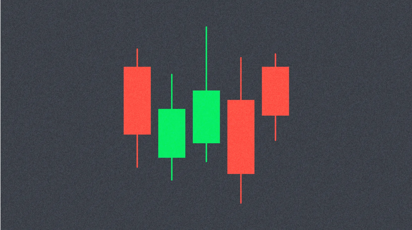
Candlestick Charts
A solid grasp of Japanese candlesticks is also useful for interpreting crypto charts. Each candlestick captures price action for a specific time frame, showing open, high, low, and close. The “real body” is the main section, and the extended lines are “wicks.”
Candle color indicates price movement for the period—green (or white) for gains, red (or black) for losses. A longer real body means greater price volatility during that interval.
Countless candlestick patterns and signals exist. When paired with other technical indicators, they help assess price direction. For example, formations like the hammer or doji can signal a potential trend reversal.
Time Frames
Time frames are a crucial factor in crypto chart analysis. Each time frame reveals distinct market dynamics and affects technical indicator interpretation. Using multiple time frames is vital for effective crypto trading.
Most charting platforms offer time frames from one second to one month. The choice depends on trading style. Scalpers seeking rapid, small profits use intervals under one minute; day traders often prefer 15-minute, 1-hour, or 4-hour charts. Long-term holders usually rely on daily, weekly, or monthly charts.
Comparing different time frames provides a more complete picture of market trends. For instance, a daily chart may show an uptrend, while a 1-hour chart could reveal short-term consolidation. Blending multiple frames improves entry and exit timing precision.
Cryptocurrency Chart Patterns
Certain patterns frequently emerge on crypto charts, making it easier to anticipate future price movements. These formations can signal trend reversals, trend continuation, or shifts in bullish or bearish momentum. Because many traders act on these patterns, they often become self-fulfilling prophecies.
Some widely recognized chart patterns for Bitcoin and other cryptocurrencies include:
-
Reversal Patterns: Head & Shoulders, Inverse Head & Shoulders, Cup & Handle, Double Top/Bottom, Rising Wedge & Falling Wedge. These suggest a trend reversal may be underway.
-
Continuation Patterns: Pennant, Rectangle, Flag, Rising Wedge & Falling Wedge. These indicate the current trend is likely to resume after a pause.
-
Neutral Patterns: Symmetrical Triangle, Ascending or Descending Triangle. These suggest price could break out in either direction.
Neutral patterns mean price could move either way; confirming breakout direction is essential before trading.
Many chart patterns common in FX trading also apply to crypto markets.
There are other methods for spotting trend reversals or continuations:
-
Higher High, Higher Low: A bullish pattern where price keeps rising and pullbacks are minor. As long as this persists, the uptrend remains strong.
-
Lower High, Lower Low: A bearish pattern where price keeps falling, setting new lows with each pullback. As long as this continues, the downtrend is intact.
These broad trend signals are critical to monitor when trading Bitcoin or other cryptocurrencies.
Divergence occurs when indicators and price action disagree. In an uptrend, divergence appears if price sets new highs but indicators do not; in a downtrend, it happens when price makes new lows but indicators fail to confirm. Divergence signals a likely retracement and is especially telling in oscillators like RSI or MACD as a precursor to trend reversal.
Other advanced chart patterns also exist. For instance, Elliott Wave Theory describes natural cycles in crowd psychology, and fractals (repeating patterns) are common on Bitcoin charts. Mastering these methods leads to deeper market insights.
Resources for Understanding Crypto Charts
A vast array of online resources is available for crypto charting, Bitcoin price analysis, and technical analysis. Key sources include:
-
TradingView – Free charting software with comprehensive basic indicators (see their subscription options for more features). Top analyst reviews and a strong community let you share and learn trading ideas.
-
BabyPips – An FX trading site offering excellent educational tools for learning technical analysis and chart reading, with content for all levels.
-
Twitter – Follow top crypto analysts for expert insights. Real-time updates help you make timely decisions.
-
BeInCrypto – Delivers elite technical analysis daily, with detailed chart reviews, market trends, and major news.
Using these resources enables ongoing improvement in your crypto chart reading and trading skills. Always consult multiple sources and develop your own analysis process.
FAQ
What are the basics of reading crypto trading charts? What is a candlestick?
A candlestick chart shows the open, close, high, and low for each candle. Bullish candles mark upward markets, bearish candles mark declines. The body represents the range between open and close, while wicks show the high and low. These details reveal market sentiment and price volatility.
How do you interpret key technical indicators (moving averages, RSI, MACD) on trading charts?
Moving averages reveal price trends; RSI shows overbought or oversold conditions. MACD visualizes trend direction and turning points. Combining these indicators helps you analyze price and volume movements more accurately.
What can you learn from chart patterns (triangles, double tops, etc.)?
Triangles indicate consolidation phases; breakout direction signals the next trend. Double tops warn of uptrend exhaustion and a likely reversal. Analyzing these patterns along with trading volume leads to more accurate price forecasts.
Do short-term trading and long-term investing require different chart analysis?
Short-term traders frequently monitor price changes and use technical analysis to anticipate moves. Long-term investors focus more on fundamentals and check charts less often, unaffected by daily swings. Short-term trading demands advanced skills; long-term investing relies on basic knowledge.
What risks or limitations should you consider when analyzing crypto charts?
Chart analysis relies on historical data and can't predict sudden market events or news. Risks include manipulated trading volumes and misinterpretation. Absolute prediction is impossible—using multiple analytical methods is key.
* The information is not intended to be and does not constitute financial advice or any other recommendation of any sort offered or endorsed by Gate.